Case studies / RHIND
Something to look forward to.
A self-initiated bodycare concept by Vera Creative Partners
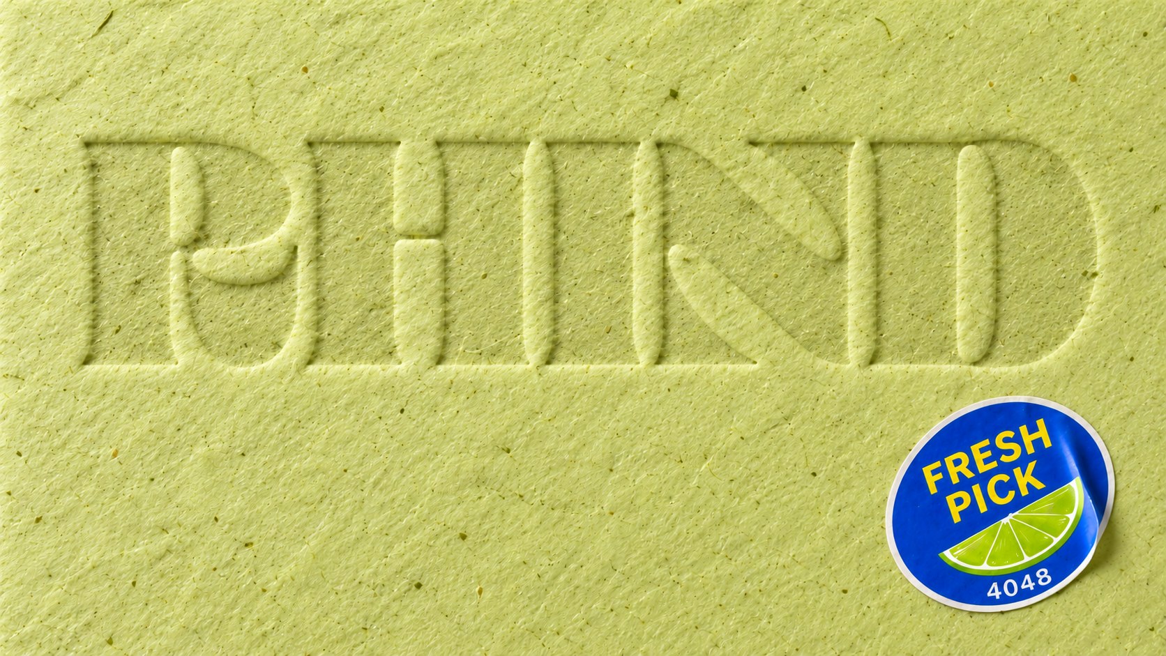
Sometimes a brand idea gets under your skin, and you have to scratch that itch. RHIND was one of those ideas—a chance to explore how far we could take one thought, from the first letterform to the smallest sticker.
Self-care turned into one more thing to get right.
 Tonight's routine
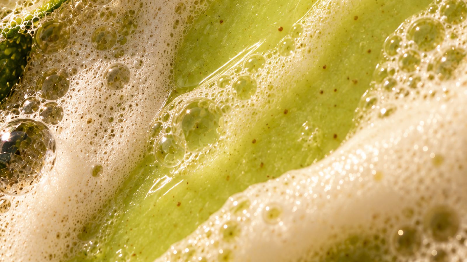
- Double cleanse, oil first, then foam
- Exfoliate, but not too often
- Tone while skin is still damp
- Two serums, in the right order
- Dry brush before the shower
- Read the latest advice, start over
+ 9 more steps
Between elaborate routines, endless advice, and the pressure to improve, even caring for yourself can start to feel like another assignment. We imagined a bodycare brand that would make the everyday routine something to look forward to.
RHIND, said like rind.
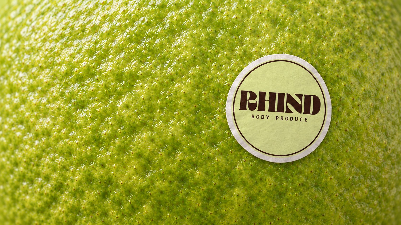
We found our starting point in the produce aisle: familiar textures, fresh color, and the small, cheerful stickers that make a piece of fruit feel ready to pick.
RHIND, said like rind, connects fruit skin with the skin we live in. That connection became the foundation for an identity built around touch, everyday pleasure, and a little playfulness.
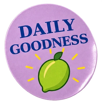 BODY
PRODUCE The descriptor Body Produce brings the idea into two words.
An identity you can feel.
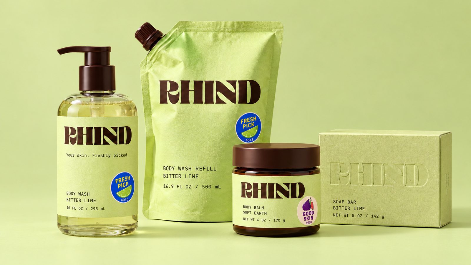
A family of lime greens holds the system together. Each material gives the color a different character: softly textured cartons, ribbed wraps, translucent paper, and frosted glass.
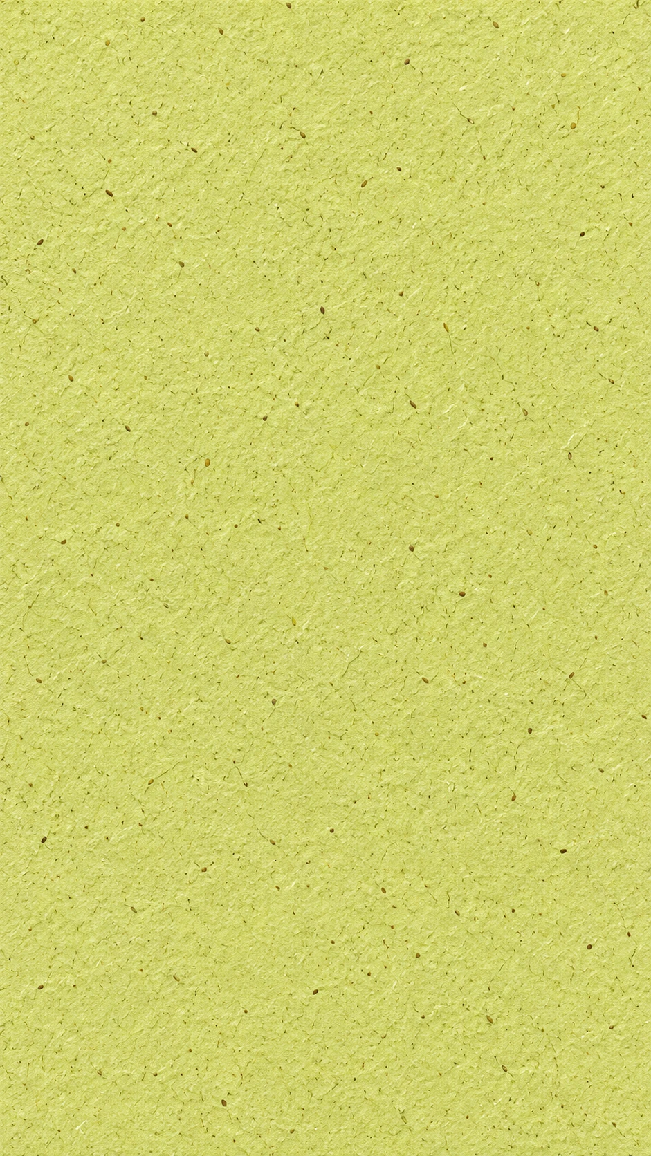
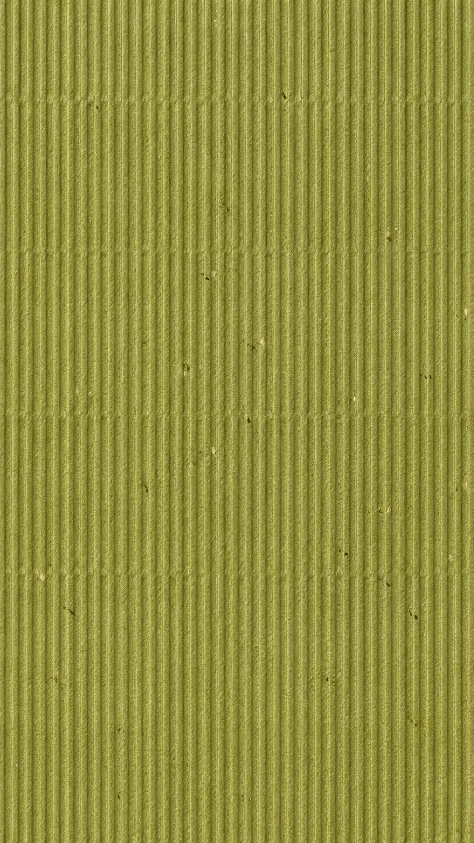
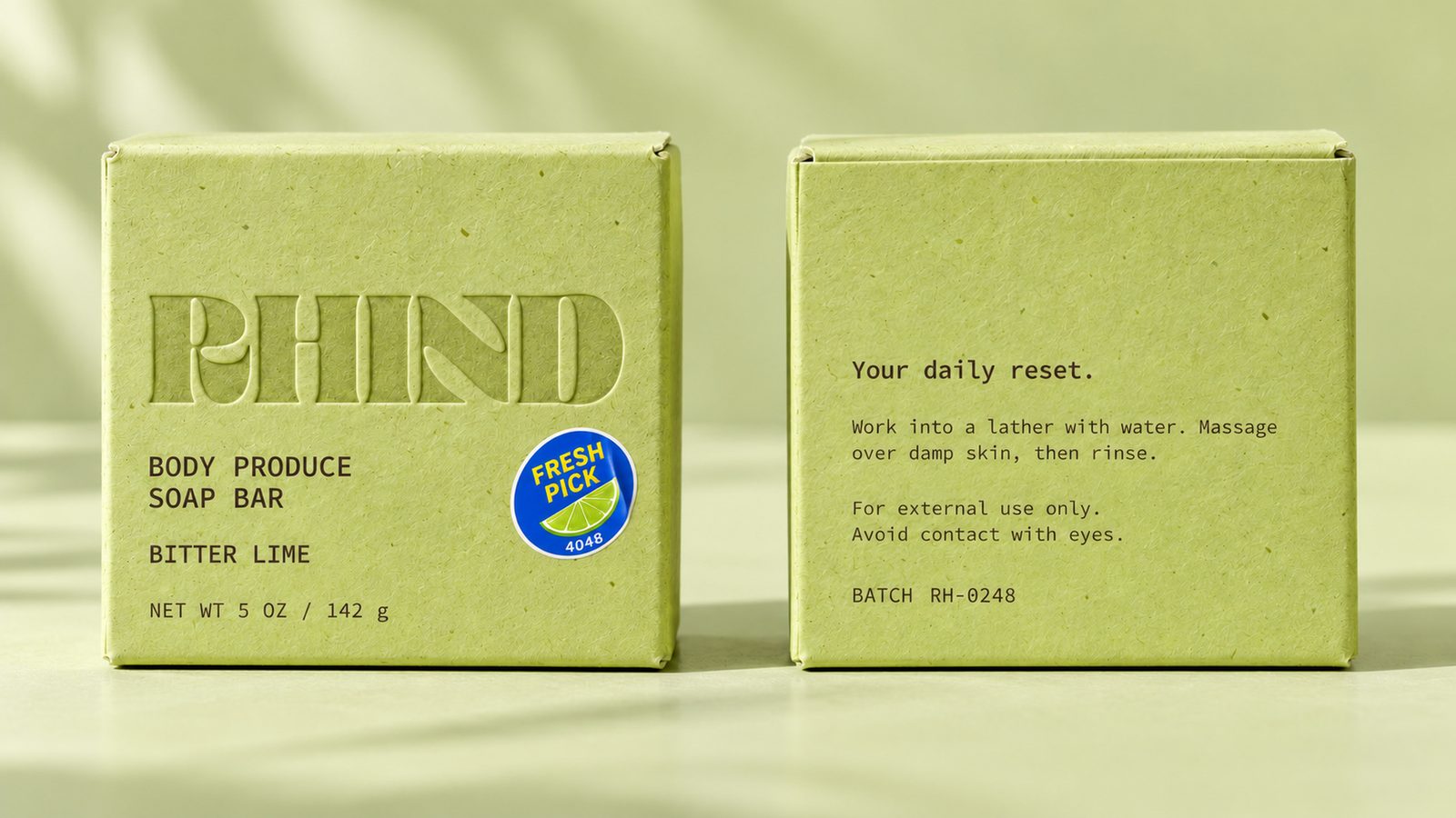
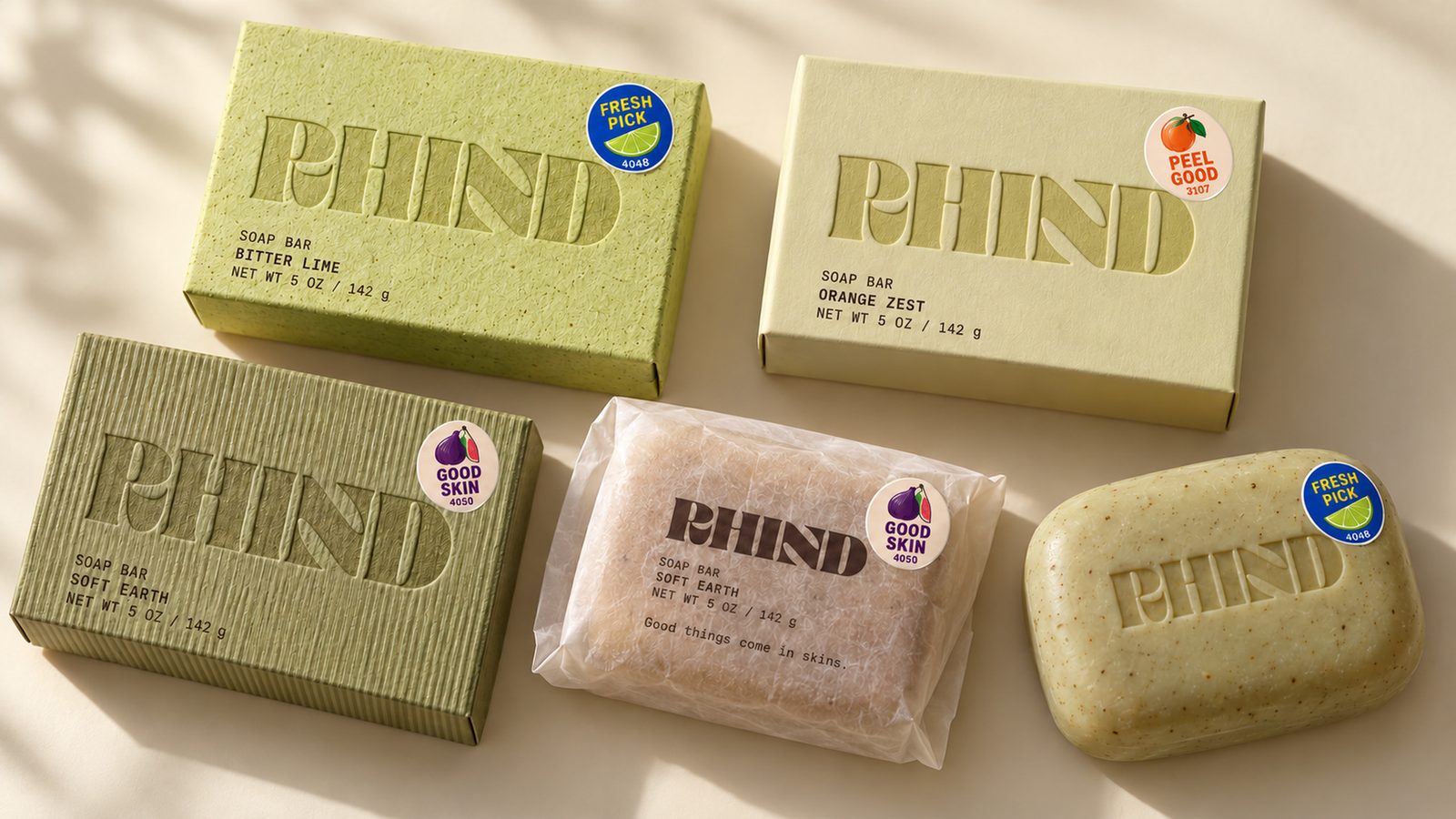
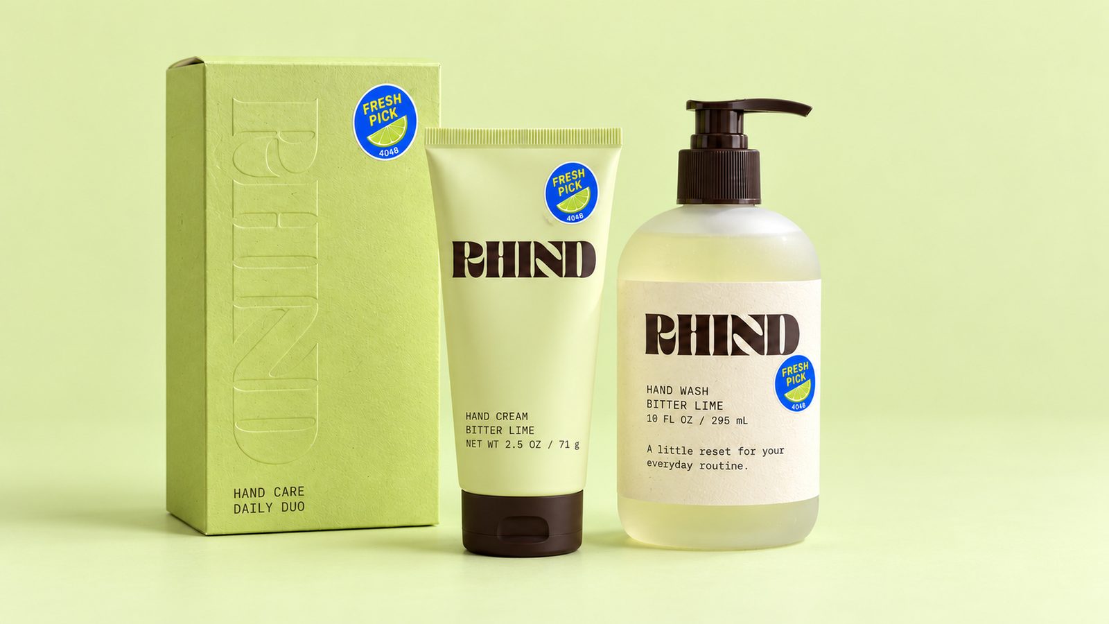
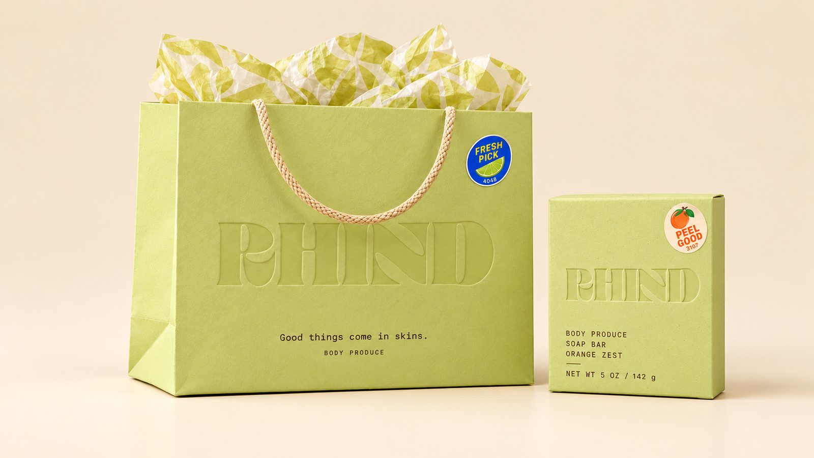
Blind debossing became the signature treatment on paper packaging. The logo sits quietly within the material, surrounded by a subtle texture inspired by lime pores. Chocolate typography provides a consistent, readable layer for product names, scents, and essential information.
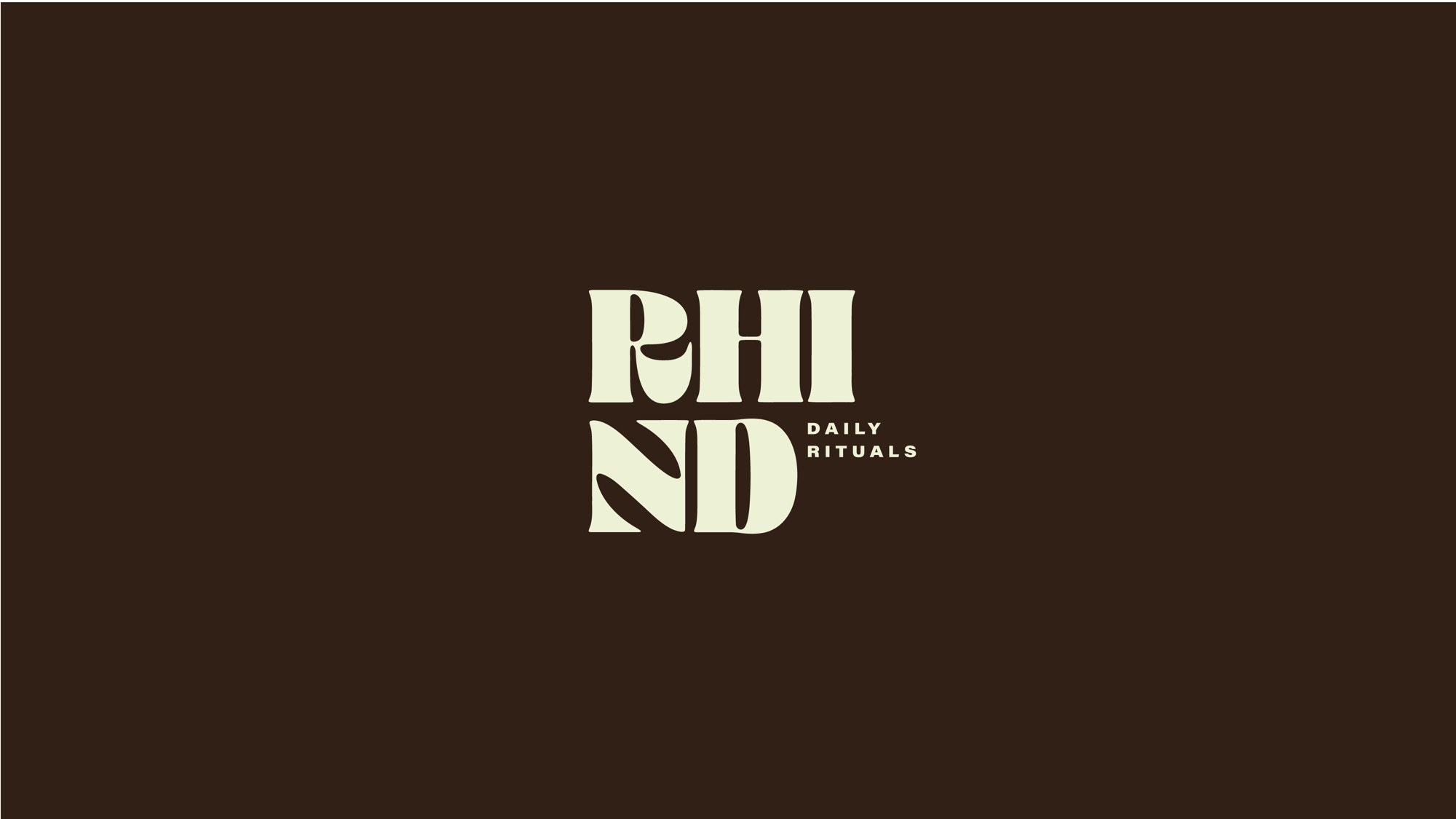
Primary
The original wordmark stays intact across every application. Its curled R and leaf-cut N carry the personality; the material and finish change around them.
Swatch labels and hex values are working stand-ins sampled from the renders.
A type system with a fresh perspective.
Its typography brings together the expressive character of the logo, the practical language of produce labels, and the clarity skincare packaging needs.
Lime textures, debossing, and fruit stickers already carry the personality, so the type needed to create order. Consolas became the unexpected headline voice. Its monospaced rhythm gives playful lines a matter-of-fact delivery, like the SKU on a fruit sticker.
RHIND wordmark
Campaign headlines
Product and scent names
Descriptions and directions
Batch information
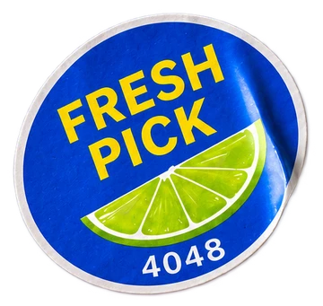
Fruit stickers
A voice that feels tactile, practical, and quietly playful.
A little color, picked with purpose.
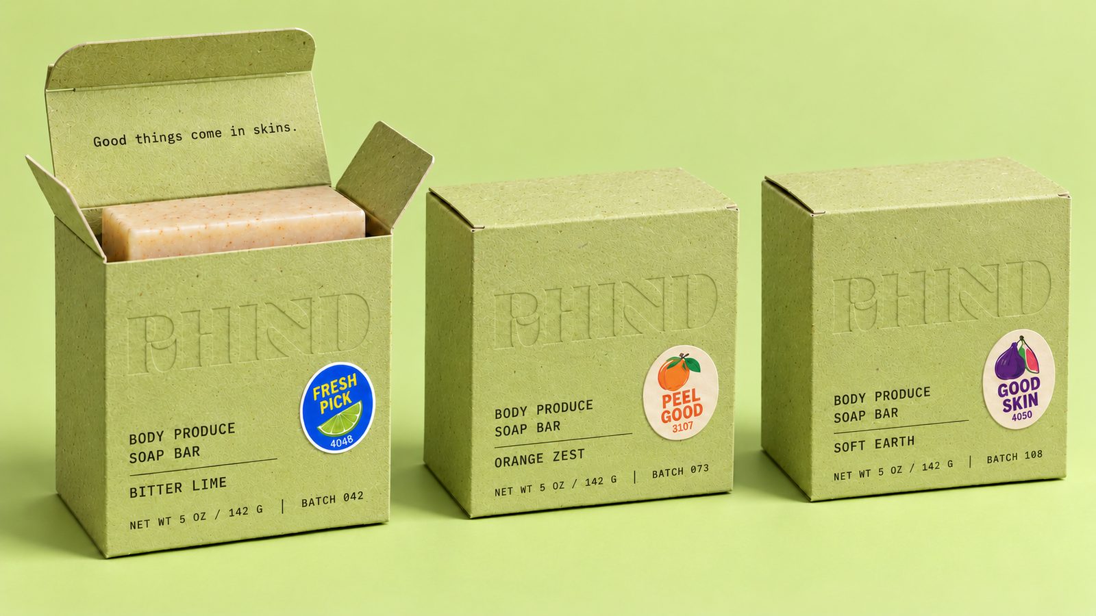
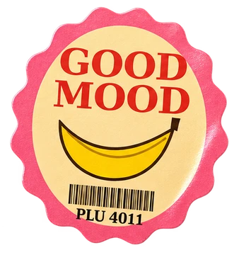
Fruit stickers introduce the brighter, cheekier side of RHIND. They also help people find their scent.
Bitter Lime wears the blue Fresh Pick sticker.
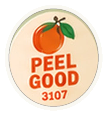
Orange Zest carries the orange Peel Good sticker.
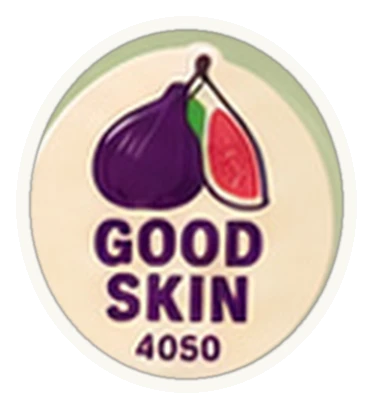
Soft Earth uses the plum-toned Good Skin fig.
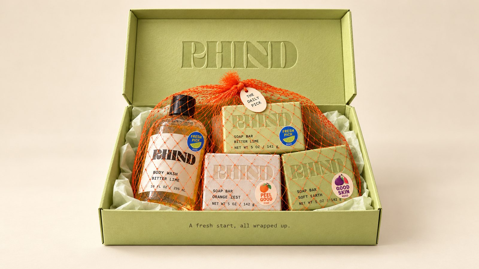
The same relationships carry across every format in the range, giving it a clear organizing system.
Orange produce mesh extends the idea into gifting. Wrapped around the products, it adds another tactile layer and makes the produce reference immediately recognizable.
Easy to spot, easy to pick.
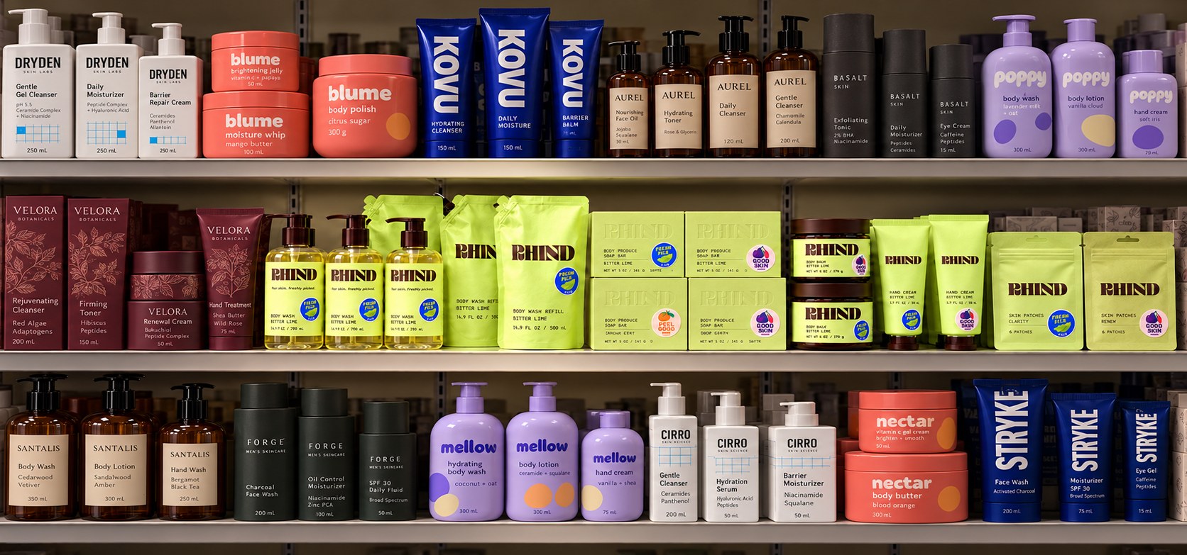
Among amber apothecary bottles, clinical whites, and loud brights, one lime-green row and a few fruit stickers are enough to stop the eye.
From packaging to everyday life.
The identity extends into close-up citrus photography, unposed bathroom moments, playful campaign language, and Fresh Patches—a concept for fruit-sticker-inspired pimple patches.
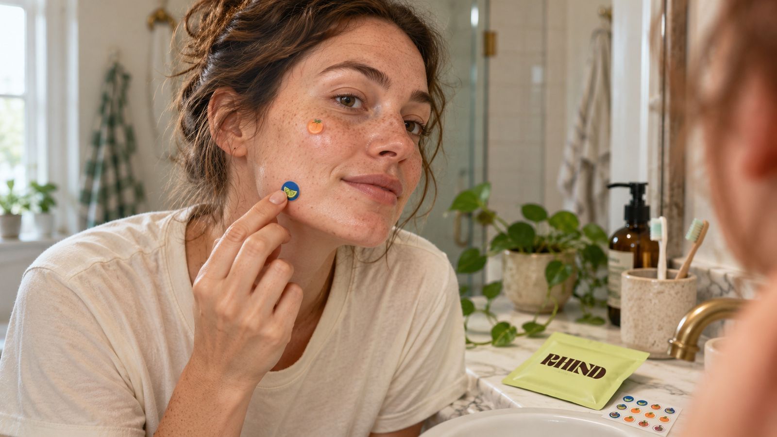
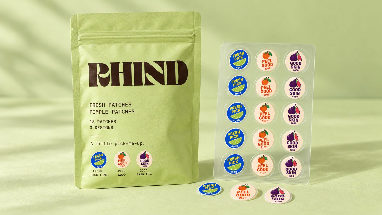
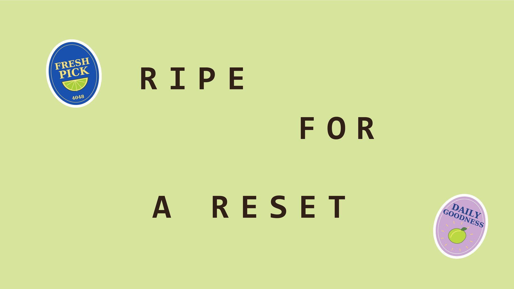
Across these applications, the direction stays consistent: natural skin, soft light, believable materials, and small details that reward a closer look.
RHIND brings one idea into a complete brand world. Texture makes it tangible. Stickers make it recognizable. A consistent packaging system gives the playfulness structure.
Product, packaging, and lifestyle imagery on this page are AI-generated mockups created to visualize the concept.