Architecture
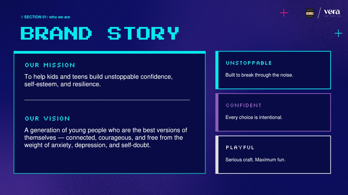
Give every audience a place.
Three sub-brands, united by one recognizable identity.
Case Studies / Rebel Ninja
A connected brand for kids, teens, and parents—from strategy and naming to identity and digital.
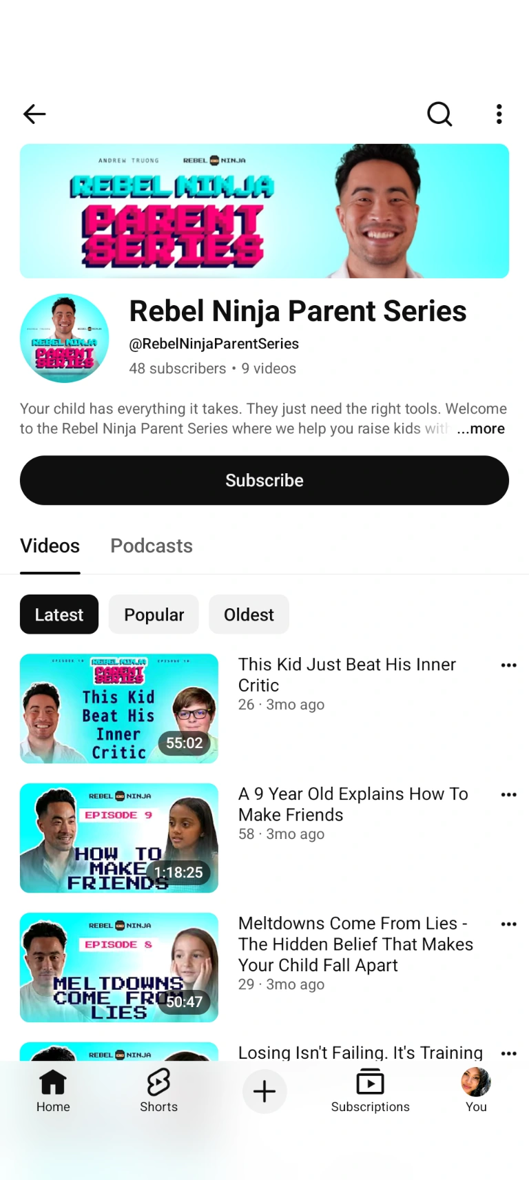
01 / The vision
Kids were the audience. Parents were the buyers. Teens needed their own way in. We gave Andrew’s ideas a clear structure for all three.
02 / Strategy
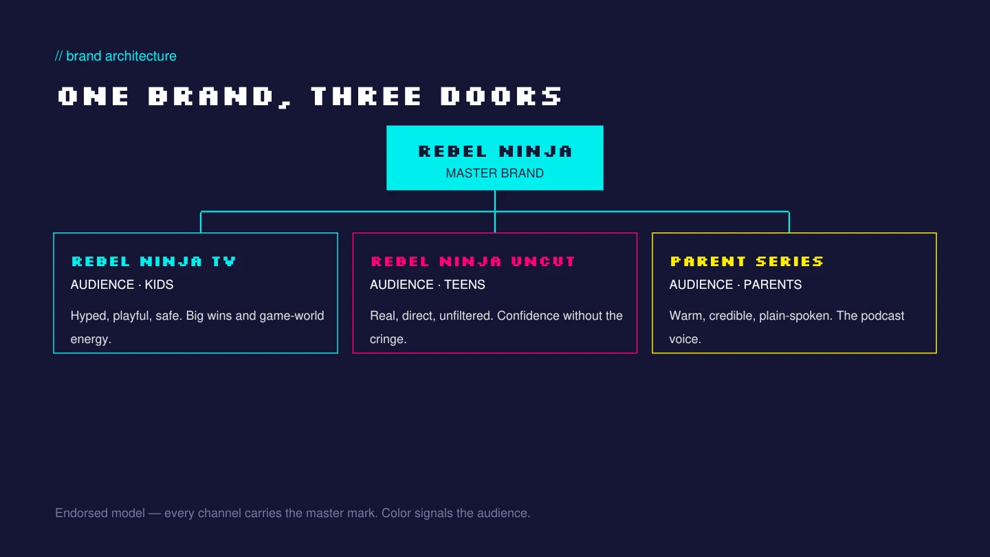
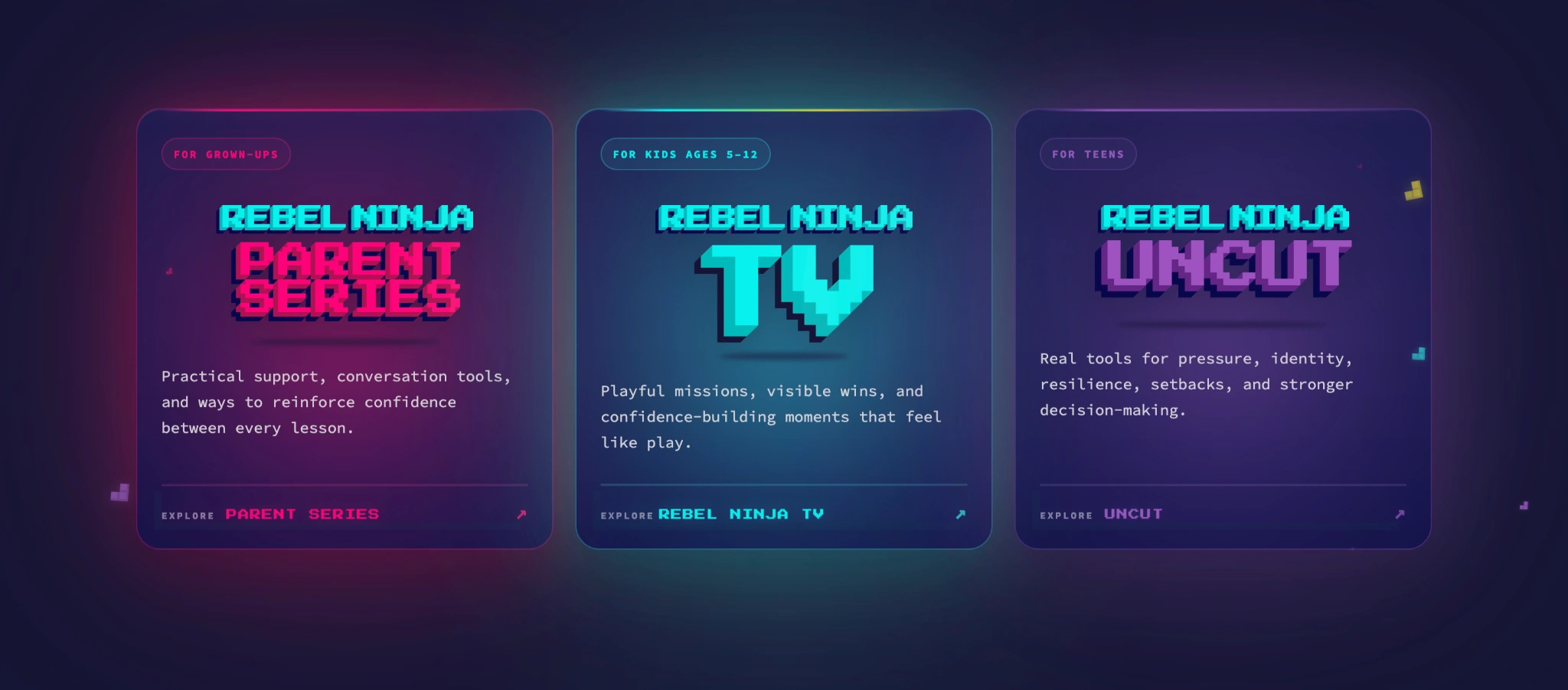
One master brand. Three distinct paths, each with its own positioning, name, voice, and visual language.
Architecture
Three sub-brands, united by one recognizable identity.
Recognition
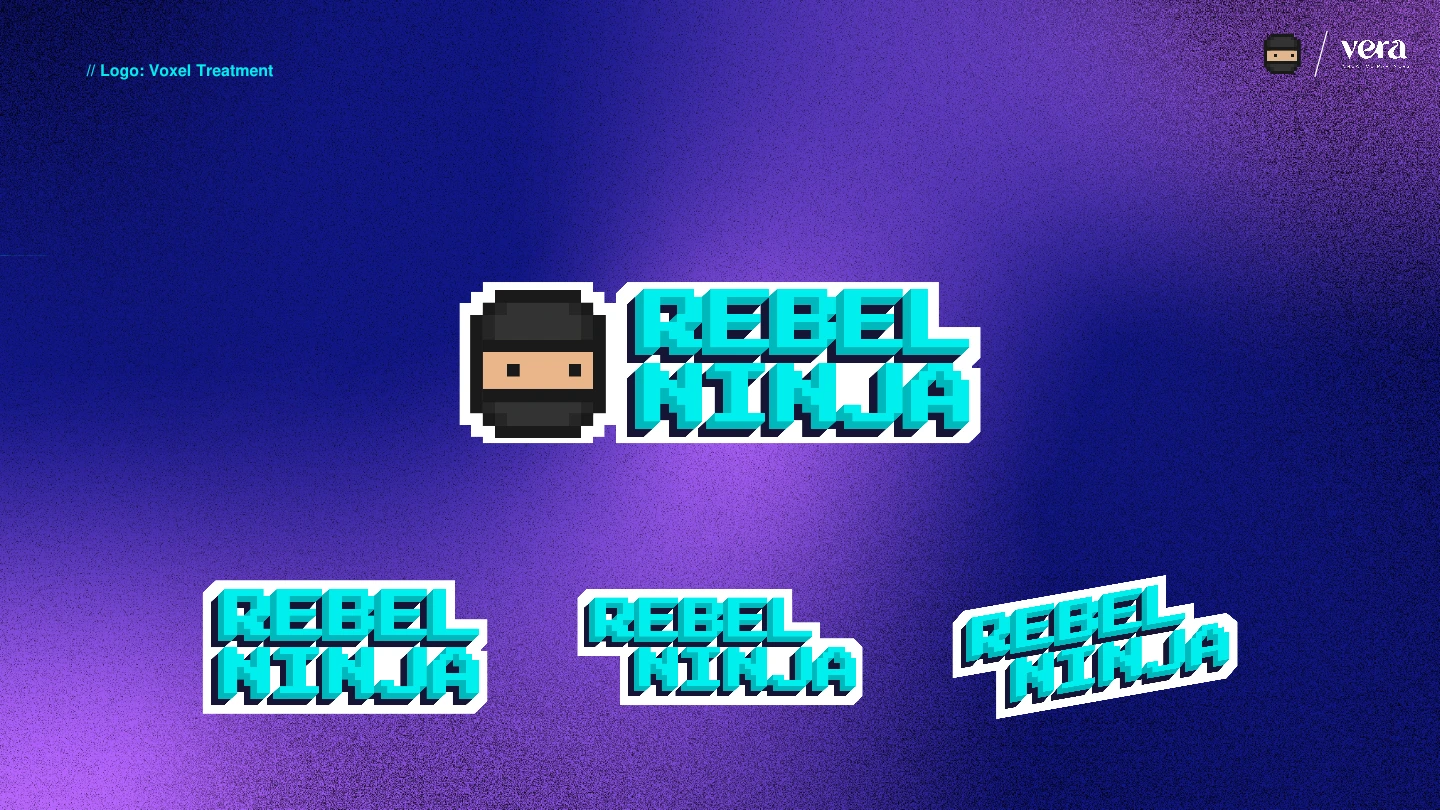
Teal, purple, and pink make the audience clear at a glance. The Rebel Ninja identity holds the system together.
Program naming / Voice & messaging
We named the coaching program around confidence through play.
Clear messaging helps families find their way in.
03 / Identity
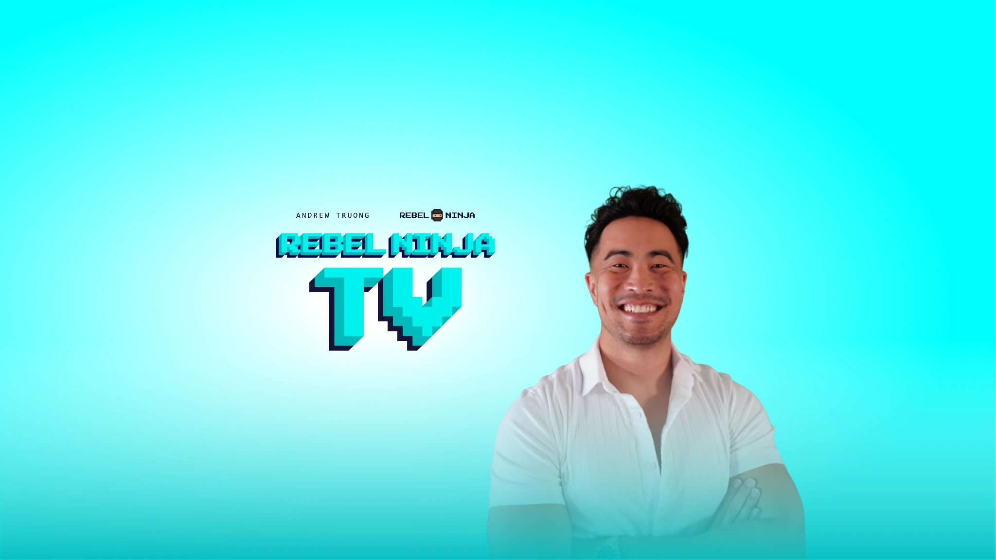
In the real world
Rebel Ninja Teal gives physical assets a bright, recognizable presence.
Inside the digital world
Midnight Blue gives teal an immersive digital home.

The Color System
Brand guidelines
A 53-page guide connects strategy, identity, voice, and audience architecture.
04 / Audiences
A shared identity, with a distinct voice and visual language for kids, teens, and parents.
One master brand
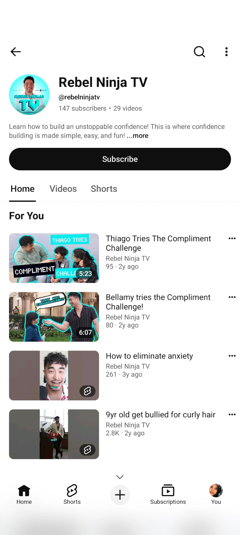
Kids / Rebel Ninja TV
Confidence becomes approachable through games, challenges, and achievable wins.
“You’ve got this. Level up!”

Teens / Rebel Ninja Uncut
A channel system that respects teens, with real language and confidence without the cringe.
“No filters. Just skills that stick.”
YouTube vlogs
Coming soonParents / Parent Series
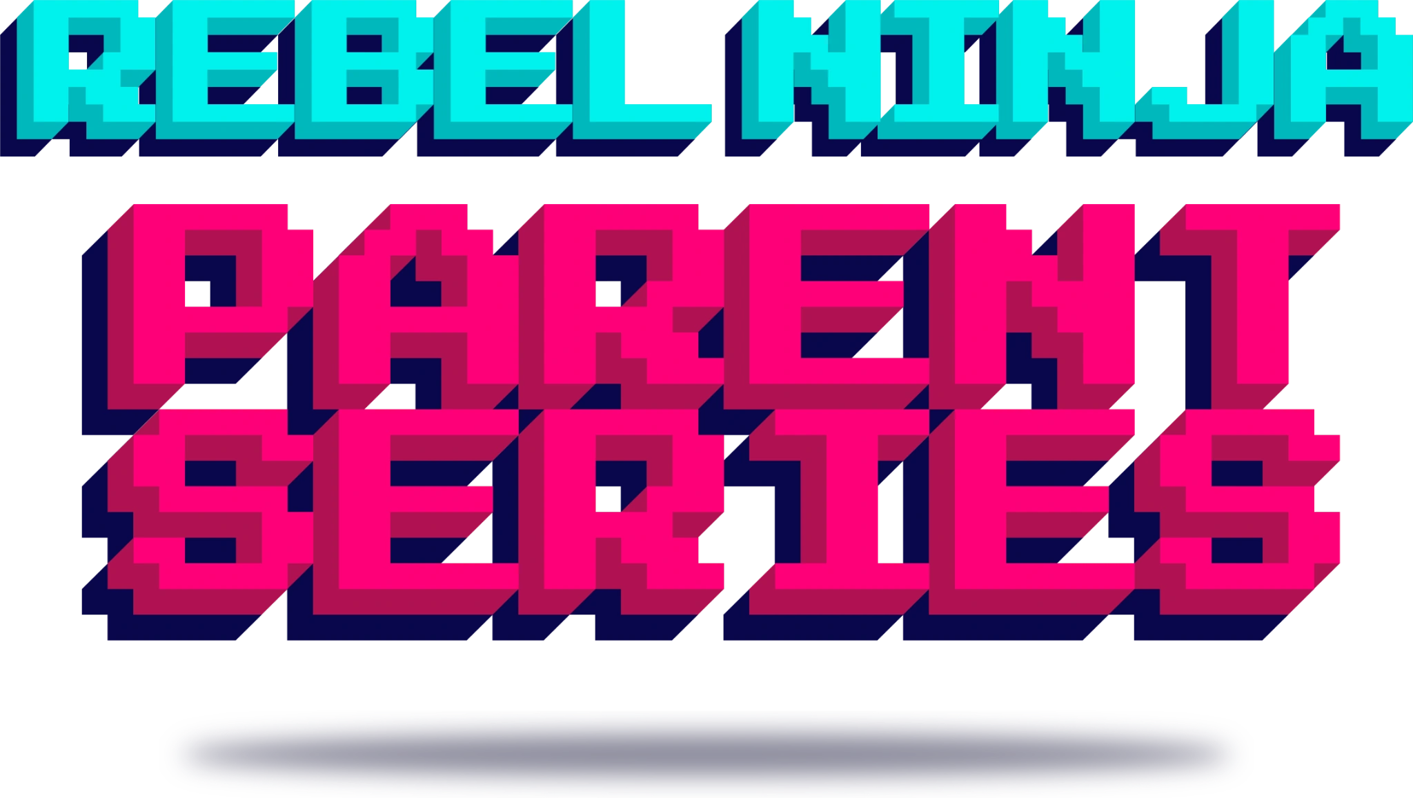
Clear explanations and practical tools that help parents support their children.
“Here’s how confidence gets built.”
05 / Digital
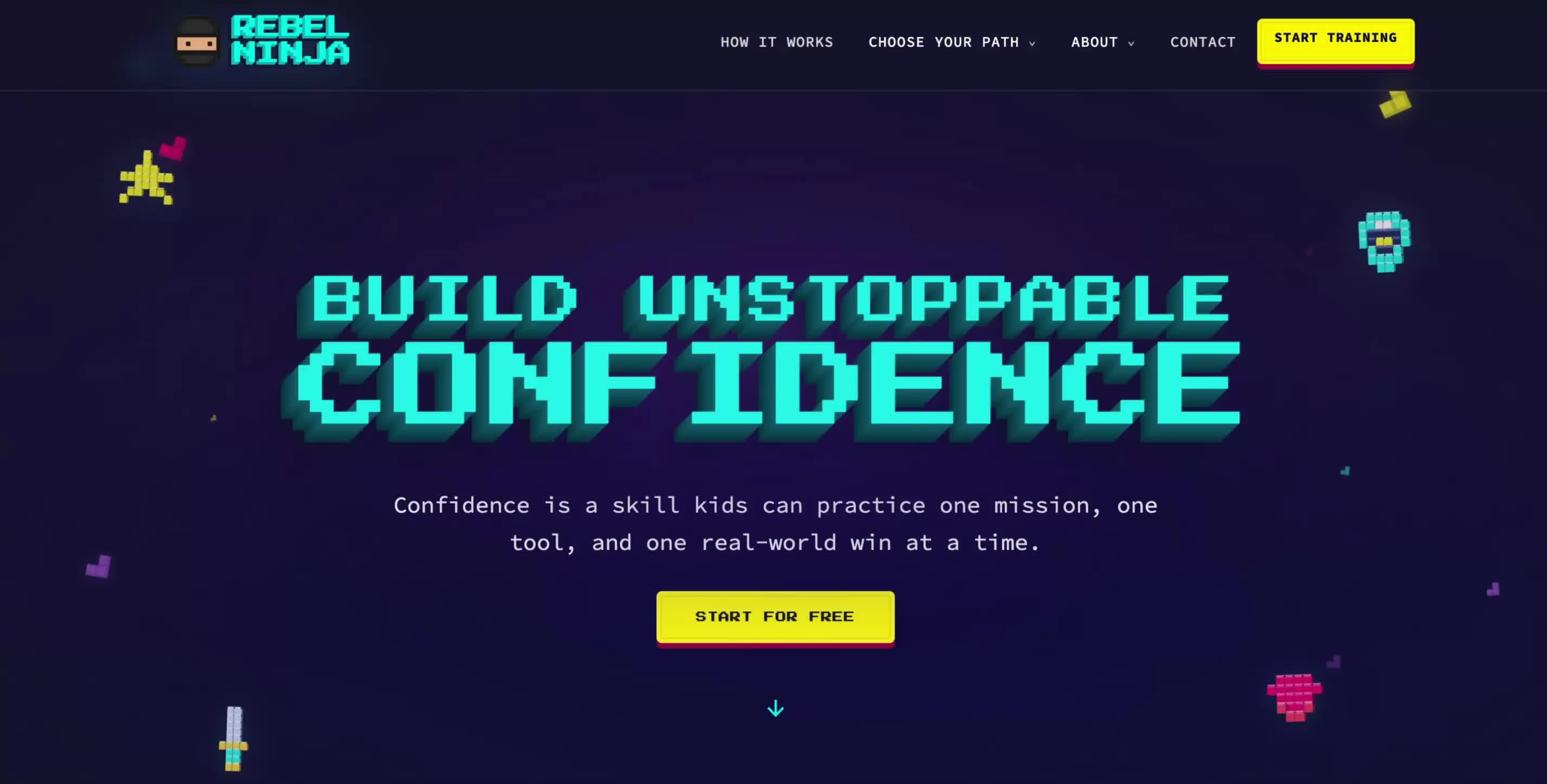
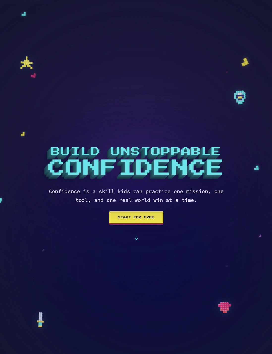
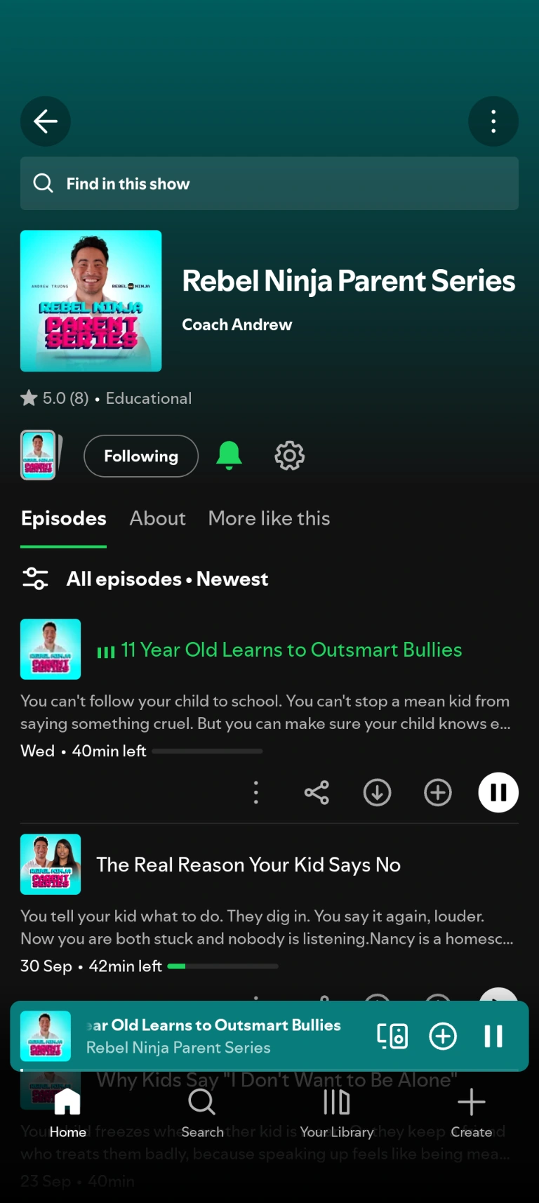
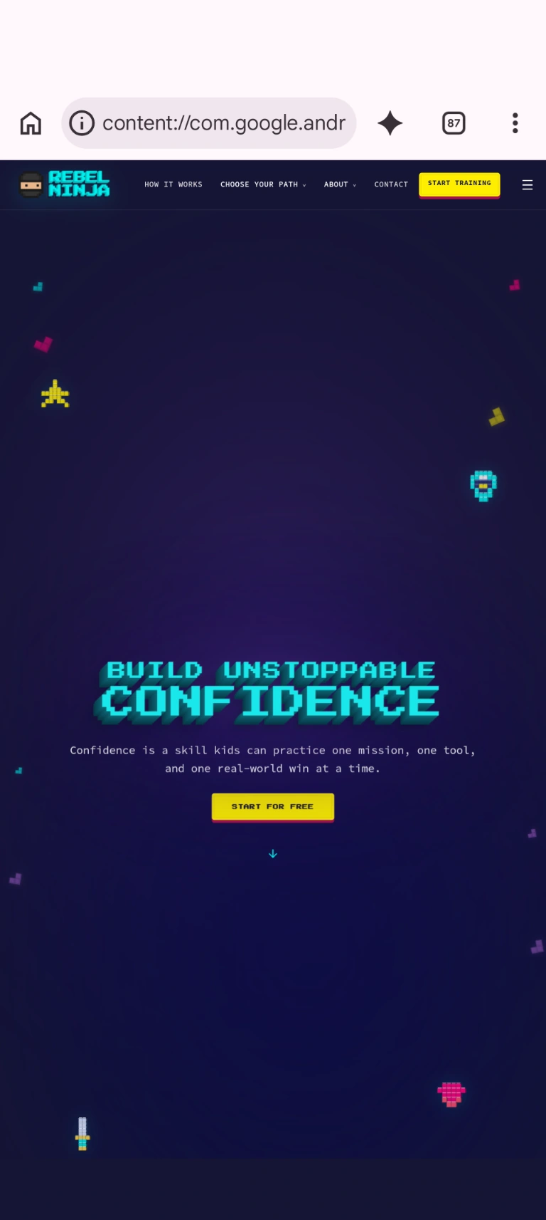
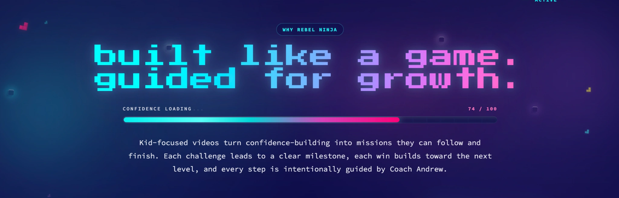
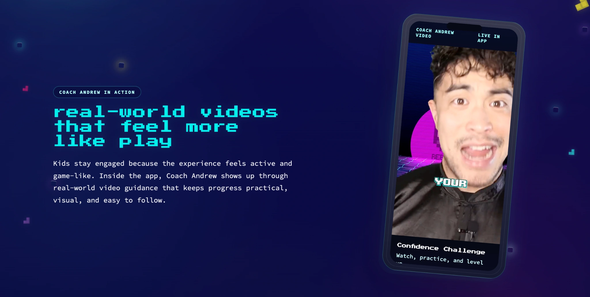
The website and podcast bring the brand into the places each audience spends time.
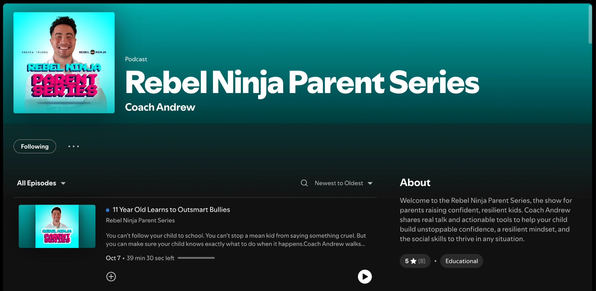
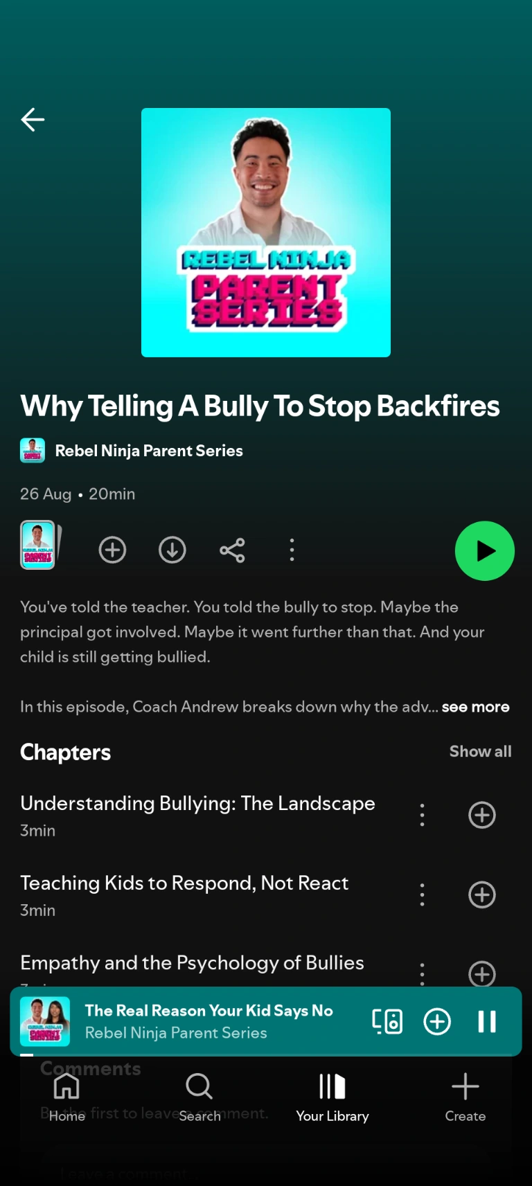
On Spotify
A distinct podcast identity brings Andrew’s practical guidance into parents’ everyday listening.
Rebel Ninja Parent Series · Podcast identity
06 / Results
Next case study
Start a conversation